Tribe Colours for Test of Time
Modifying the different colours used to identify the tribes in Civ2 'Test of Time'.
by Cam Hills (March 2000)
Updated May 2000 |
See the Footnote on the dark shades used in unit sprites that has been kindly contributed by DracoOmega.
Colour confusion? |
The colours used to define the different tribes in Civ2 Test of Time has, to say the least, been one of the more contentious points amongst people who have purchased the product. Many have reported difficulty in distinguishing some of the tribes due to alleged similarity of 'tribe colour' — the actual colours that identifying each tribe.
For instance, some concern has been expressed over the light blue and green tribes — while the text colour of their cities' names are quite clear, the shield colour of units may be confused as both take on an arguably darkish aqua tone. When they are side-by-side it is clear, however away from direct comparison some problems have occurred.
The Fix |
Adjusting tribe colours is a task that is relatively straightforward to fix. For scenario authors the amendment of tribe colours can add a visual twist to your game — adding a point of difference from the default colours. Even for those people who simply want to change the tribe colours for the default game, the solution is fairly simple.
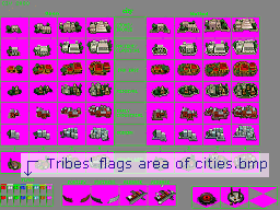
The relevant graphic that needs adjustment is the cities.bmp file — where in the bottom-left corner are the flag images.
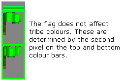
For each tribe (plus the barbarians), there is a flag 'area' — three horizontal lines of colour (bright-dark-bright) then underneath two flags. Despite there being several elements, there are effectively only three areas of relevance:
- The second pixel along the top band of colour,
- The second pixel along the bottom band of colour, and
- The top flag image.
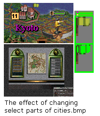
The following example below demonstrates what happens when you experiment with the Japanese (green) flag. It is an impractical example for a scenario, as there is little consistency between the colours, however these were used to illustrate the contrasting effects;
The second pixel along the top band of colour will change;
- The colour of the font of the city names of a tribe.
The second pixel along the bottom band of colour will change;
- The colour of the box used to identify the city size (or city revolt),
- The colour of the tribe in the diplomacy screen for dealings with tribe emissaries, and
- In some cases, the colour used in the tribe's units' pictorials.
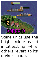
However, a darkened version of this colourFootnote is used as;
- The colour of units' "shields" — being the octagonal marker left of a unit's health bar.
- In some cases, the colour used in the tribe's units' pictorials.
Unlike 'traditional' Civ2, 'Test of Time' does not use any colours in the flag graphic to dictate other aspects of a tribe's colours.
Implications for Scenario Authors |
The effective implementation of tribe colours is not difficult, although some thought should be given to the final effect on the game:
- Does the colour of the tribe flag chosen match the other colours used to identify the tribe?
- Does the colour selected for the city names match with the other tribe colours?
- Are the colours in both the bright and dark form clearly distinguishable from other tribes?
- Is the colour of the unit shield bright enough to distinguish a unit's actions? For instance engineers may; irrigate "i", terraform "o", mine "m", build roads or railways "r", build fortresses "f", or go to a location "g". These actions should be clear to read in the unit's shield area.
This quick modification to the cities.bmp file can make an important distinction to your own game or scenario.
Footnote (May 2000) |
At the time of writing this tip, there was no way known to overcome this darkening effect, however...
Draco Omega writes:
- I know exactly what is causing the problem, the sprite file itself.
- Every pixel in a sprite file has a flag that tells if it is a team color pixel. Normal pixels are drawn with the exact color values in the file but team color pixels are handled a little differently.
- The set color values of the pixels are all shades of grey (the red, green and blue values are equal). To determine the color the pixel is drawn in, it first looks at the color ratio of the pixel on the bottom line in cities.bmp (as discussed in this article). For example, let us say the color in cities.bmp was Red 255 Blue 128 Green 0. This gives it a color ratio of 2:1:0. Now lets also say that the team color pixel was Red 64 Blue 64 Green 64. It converts this value to the same color ratio as the pixel in cities.bmp. In this case that would be Red 128 Blue 64 Green 0. Therefore the value of the pixel in the sprite file determines how bright the color is. This factor will be able to be customized as hoped when the Sprite Workshop is finished.


