The Palette Explained
Understanding the various Civ2 graphics and how rearranging the palette may impact on these.
by Allard Höfelt (December 1999)
The Palette Explained |
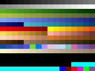
Every GIF and BMP file has a palette that is included in the graphic. You can view this palette and edit it in almost every good graphics editor. Civilization II has very complicated but interesting rules for using the palettes in its files. I will try to explain it as much as I can here. Every colour in the palette has a position, a number. This is usually displayed below the palette when viewing it in most graphics editors. In a 256-colour GIF file, palette numbers vary from 0 to 255.
Not all the palettes in the various civ2-game files are the same. They vary slightly to their designated use. Some palettes have grey backgrounds, for example, other ones a pink background, and other ones a violet background. I recommend loading the same palette (I recommend the UNITS.GIF palette) in all files.
Civilization II will recognise only the colours supplied in the UNITS.GIF. So if you use a totally different palette in, for example, CITIES.GIF, the game will simply use the colour that appears in that colour's palette location in UNITS.GIF
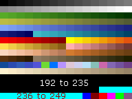
In the game, 192 to 235 will simply become black. 236 to 249 will show up different colours than you have chosen in the palette. They are: Creamy White, Light Grey, Dark Grey, Blood Red, Light Green, Yellow, Dark Blue, Violet, Light Blue, White, Black, Bordeaux Red, Green, Olive Green. You might be able to use these colours simply as extra (unchangeable) colours of the palette, but I do not know of any further use of these.
Watch out with these colours! In the standard palette they all have the same colour and if you pick one to paint with it, most graphics program (like Paint Shop Pro TM) will automatically pick the first of the same-looking colours. This problem is also very well known with the standard grey background of some .GIF files. You can avoid this by editing the palette and giving them all individual unique colours.
Palette number 249 however is used in CITIES.GIF to locate the city size box.
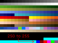
At palette number 250 the special colours start: 250 looks blue in the palette and will appear as dark blue in the game. This colour is actually only used for giving the co-ordinates of the shield on the units and cities (will be explained later).
Palette 251 and 252 (normally dark and normal red) work together with certain units (shield, airbase, etc.) to indicate the nation's colour. They will change according to the owning (or occupying) civilization. Palette 251 will appear as the alternative (darker) nation's colour, while palette 252 acts as the lighter colour (See CITIES.GIF for more information). The Airbase icons do only recognise palette 252 and will not show palette 251 correctly. At any place where these two colours are not used, the game will simply use them as blue and violet.
253 until 255 will become transparent (invisible) in the game and are used as backgrounds in the files (253 and 255) or as borders (254).
Cities.gif |
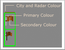
A nation's colour consists of three colours. They are all customisable on the lower left corner of CITIES.GIF. On top of every flag there is a thin line of all civilization's individual colours. The most left pixel of this line (co-ordinates of the file (1,423), (16,423), (31,423), etc.) will indicate the colour of the letters under the cities as well as the colour of the civilization on the radar map. It also influences the colour of the tribe in the demographics and at various other places. Another important pixel is the pixel that is located (from the green border around the flag) at 5 pixels down and 4 pixels right (co-ordinates (19,429), (4,429), etc.). Changing this pixel will affect the unit's owning nation's primary colour (palette 252), as well as the city size box and various other places, such as the line on how the civilization performed on the Power Chart.
The pixel located at 5 down, 7 right ((7,429), (22,429), etc.) determines the unit's owning nation's secondary colour (which will be "loaded" by using palette 251). This is not often used in the game (perhaps not even at all?), but only if you choose to include two shades of the owning colour in the shield. (Note: It is also used in the 'Tribes' editor of the scenario editors of Fantastic Worlds). The rest of the flag will simply be displayed as it is. The second row of flags is unused.
To the right of the flags are the icons to be utilised for a fortified unit, a fortress, an empty and a full airbase. The latter two allow palette 252 to be used and will therefore change according to the occupying civ.
The city icons are either not walled (left) or walled (right) and are in 4 sizes. Palette 249 in the border on top and on the left of any city icon determines the top-left corner of where the city size box will appear. Palette 250 will show where the nation's flag will appear. The Modern Alt. was not used by the game prior to the launch of Civ2 Test of Time.
All other icons, text etc. in the file have no specific meaning and can be removed.
See also Flags and Civilization Colors by Dan Scheltema.
Units.gif |
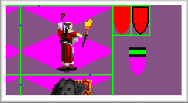
The shield may have any form within the square designated, except upper 7 lines of pixels. Of the three individual shields in the UNITS.GIF upper right corner, only one is being used by the game, i.e. the red one directly beside the Fanatics unit.
You can change the colour of the shield to the owning civilization by colouring it with the red colour (palette index 252). Using palette 251 (normally dark red) will give the shield the alternative nation's colour, as described earlier. Using a mixture of both these colour will allow you to smooth the unit colour. Basically, any colour can be used in the shield square, and that colour will be visible in the same colour in the game. Exceptions on this are palette 192 to 255.
Many colours that will appear in the game are also customisable in UNITS.GIF. As told before, the palette in UNITS.GIF will affect all other files too, so it is advisable to apply the same changed palette to the other files to avoid ugly and unwanted colours.
The Radar map's sea colour uses palette 83. The land colour uses 38. The Radar map's nations' colours are already explained in CITIES.GIF.
Text in the top border of all pop-up boxes is actually the UNITS.GIF's palette 16, with a shadow of palette 0. Some text (like "viewing pieces" on the right) is made of palette number 31 with a shadow -again- of number 0 Most other text is palette 6 with a shadow of palette number 23.
Icons.gif |
I will not explain how the various icons on the right will be used. They have nothing special about them. I will only speak about the icons on the left half of the screen.
First of all, the grid lines. You'll see five different grid lines. The highest of these, with the fat lines, is visible if you right click on the map and go to the "viewing pieces" mode instead of the normal "moving pieces" mode. This grid icon is also shown in the city viewing screen when a square is being used by another city. So, if you change this icon, keep in mind it will also be visible here, and perhaps then try to avoid it. The grid below this is viewed when the grid is turned on (control-G). If you now right click somewhere, both will be visible, with the first grid (the upper one in icons.gif) on top. As far as I know, all three other grid icons are not used.
Below this second grid (the one that appears when grid is turned on), you'll see the background of the title of almost all civ2 texts boxes and most other things. You certainly have noticed it. There's also a second background used, the one used in the interface box on the right of the screen when playing, and also the background of all pop-up boxes. This texture is created by tiling the upper-right texture (left of the Woman's Suffrage Wonder). The two other textures are not used.
Left of this are three symbols for disorder, of whom only the most left is used. A little bit farther to the left is the symbol for pollution. If you switch off pollution in your game, it may be best to remove this icon altogether.
Between the pollution icon and the battle animation icons are the various food, money, happiness etc. icons. They are: shortage of food, corrupted shields, wasted trade, the four stages of research (the icon above that serves no function). Second row: Food, shield, trade, the four stages of pollution. Third row: Luxury, money, research. Fourth row: unhappiness due to troops, wasted cash.
Further we can see some battle animations, which will be showed after each other when a fighting takes place, an "up" and "down" button, for switching to the next or previous city in the city viewing screen, and a few more buttons (close, zoom in, zoom out, eye), which are used either in the main map screen and the other map screen you get when right clicking on the radar map (I believe only in cheat mode).
All other icons serve no function (the colours in the left bottom, the empty buttons, the other three grid icons)
Terrain1.gif |
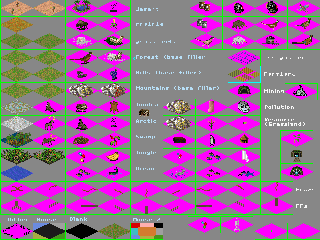
There are a lot of useless icons in this file(!), but also some quite useful ones. The most left column are the terrains used. The ocean icon is not used, except when you zoom out the map a bit. Instead, the ocean is made in Terrain2.gif (as outlined below). The second column is totally useless. The third and fourth column are the resources that can appear on the terrains left of them. Only the resources of Grassland are unused, because Grassland doesn't have resources but used another icon instead (icon under pollution on the right).
Below these columns are two rows of roads and railroads. Below that are five important icons. First the dithering. The black spots will be filled with the icon that stands three squares to the right, while the pink will be filled with the terrain that occurs on the specific place of the map. Feel free to add more black spot to make it smoother, but be careful about removing the black spots because this may lead to extremely ugly horizontal and vertical lines. The icon marked 'mouse' next to the dither icon modifies the left-click mouse behavior however to little practical effect. One more further right (marked Blank) is the icon that will be showed on any unexplored terrain. To illustrate one use — if appropriately altered it may give a very nice touch to an exploration scenario in the Renaissance period. One more to the right is the background filler to be filled in the black spots of the "Dither" icon, three more to the left. If you're making a winter scenario, make this square white! For the last of these five icons, the one marked 'Mouse 2', I have to say exactly the same as to the other "mouse" icon.
Now we move to the right half of the screen, where the first 3x4 icons in the right top corner are completely useless and can be removed for the sake of clarity. Below them is the icon marked as "irrigation" and that also functions as such. Below that are Farmland, mining, pollution (think of removing it when pollution is switched off), the special grassland resource and the all-famous goody hut.
All other icons in terrain1.gif are unused.
Terrain2.gif |
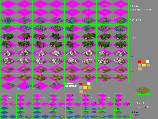
The first two rows have no use, but are handy for quickly seeing the direction to which the following rows of icons need to be faced. So, the first icon on the 3rd row means, if you look back at the first icon on the first row, an unconnected river. This row and the next row give all possible directions for the rivers. The same thing for forests, mountains and hills.
Then follow the four connections of rivers with ocean. There can be more of these connectors in one square (when four rivers finish in one lake!), so remember not to overlap too much space when changing these.
After three more useless rows for the game but useful rows for the creator, there are another three more rows. Every little square will eventually (in the game) fill in one quarter of a square. The upper row is for the upper part of the square, the middle one for the lower part, and the two last ones are for the left and right parts respectively. If you take an empty square and construct them together, you'll see that they fit exactly! The 'w' and 'l' in the rows above indicate if the square on that side of the icon is w(ater) or l(and).
The four most left icons form the ocean (not immediately next to land) together. So the best way to construct your own ocean is to first make a normal square, like any other terrain square, then select the 4 parts and copy and paste them into these little squares. Paint Shop Pro allows you to save selections, so that will save you a lot of time.
Again, all other icons on this page are unused by Civilization II.
Conclusion |
There are doubtless still plenty of things that I have yet to identify. The only way to really find out is by playing around with them. As for the colours: you could even change every single palette colour individually to find out what it does! You can also find out useful things by taking a screenshot, converting it to the used UNITS.GIF palette and looking what index in the palette the colour you want has. This is however not 100% 'foolproof', since loading a palette always means loss of colours. Always check if it's right, before trusting it.
